27 numbered subs
Made the full numbered menu searchable and filterable on a dedicated customer route.
Local business website
A heritage-led, multi-route redesign that turns a dense single-page restaurant site into a focused, mobile-friendly journey for menu discovery, party subs, story, gear, careers, and visits.
Made the full numbered menu searchable and filterable on a dedicated customer route.
Separated menu, party-sub, story, gear, visit, and careers tasks from the homepage.
Centralized indexing, canonical, review-route, and careers controls for owner approval.
The challenge
Dino’s Subs has decades of family history, a large menu, and a loyal local identity, but the original single-page site asks visitors to scan nearly every concern in one long document. The redesign needed to improve task finding without inventing prices, availability, ordering capabilities, or owner-approved facts.
Miguel reorganized the experience around seven customer-focused routes, rebuilt the visual identity from approved source artwork, and implemented the site with React, TypeScript, and progressive motion. Menu discovery, visit planning, party-sub guidance, sharing metadata, and launch controls are explicit while production decisions remain owner-controlled.
Verified prototype
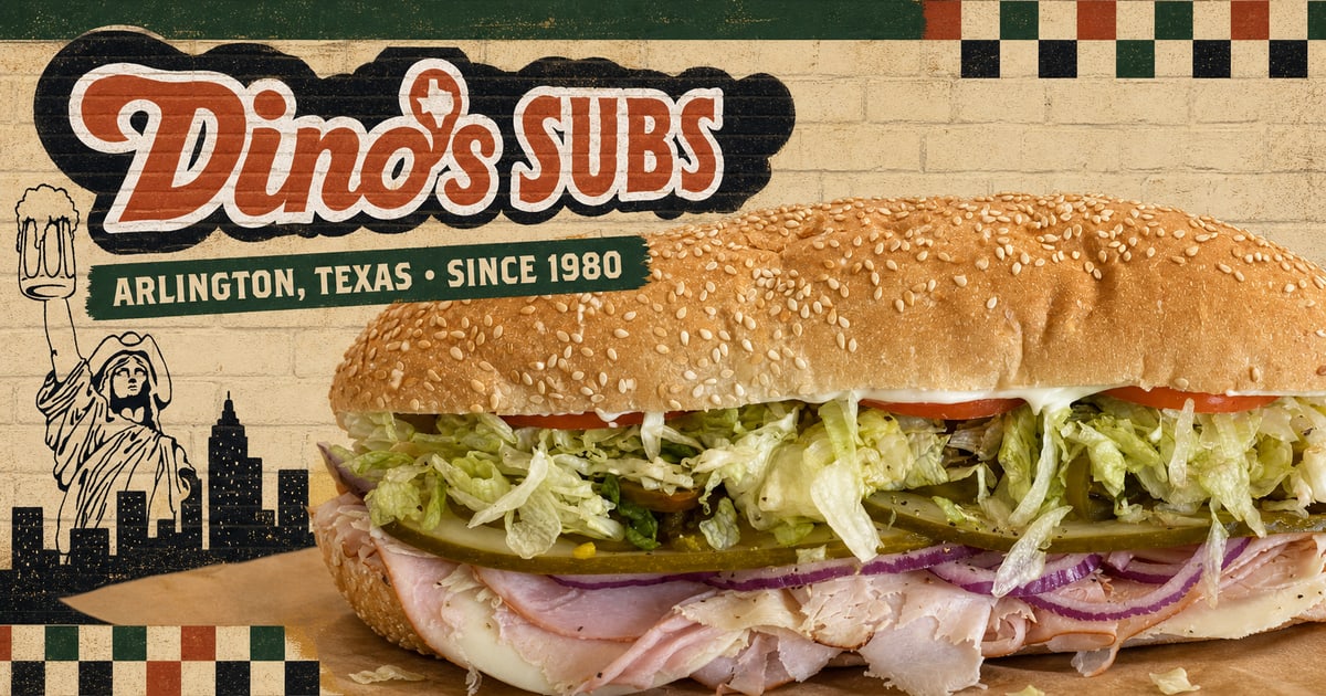
The owner-review candidate keeps Dino’s recognizable food, skyline identity, checkerboard cues, slogan, and family history while giving each customer task a clear destination.
01MenuAll 27 numbered subs with search and filters
02Party SubsSizes, servings, lead time, and planning rules
03Story + GearFamily continuity and register-only merchandise
04Visit + CareersPractical trip and application information
Behind the build
Verified current repository, asset-provenance ledger, owner launch worksheet, and desktop/mobile before-and-after evidence.
The information architecture separates menu discovery, family history, party-sub planning, merchandise, careers, and visit details so visitors can go directly to the task they came to complete.
The classic skyline mark, checkerboard cues, heritage typography, shop photography, and restrained cream, red, and green palette connect the digital experience to the South Collins restaurant.
Unknown prices, allergen guidance, availability, brand approval, image permissions, canonical domain timing, and desktop/mobile acceptance remain explicit owner gates rather than being filled with assumptions.